OkCupid Global Messenger
Overview
In early 2015, millions of messages were sent on OkCupid every day. The system used to send them was technically robust, but the user experience was far from perfect. After identifying numerous pain points and usability issues, we began work on a project to address them.
My role in the project encompassed a variety of responsibilities, including high-level strategy, UX design, and visual design. I worked closely with software engineers to bring the feature to life, and collaborated with the data science team to measure its success.
Some Historical Context
Prior to implementing Global Messenger, there were actually two separate systems: chat and long-form messaging. Confusingly, messages sent in one system did not show up in the other. You could simultaneously have two conversations in separate interfaces with the same person. Adding to the problem, there was no concept of chat in the mobile apps, so conversations started in the desktop chat would drop off when people were on the go.
User Behavior
From observing users, we found that there were two important use cases to consider: sending first messages and replying to first messages. Each had distinct workflows.
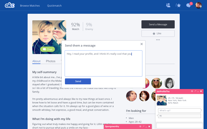
When composing a new message, we saw that users frequently closed and reopened the message window several times before finishing, since the message window covered the profile. This made referencing the profile content a chore. When replying to a message, users faced similar hurdles. Usually people first read a message in their inbox, then went to the sender’s profile to learn more about them. But once there, they still needed to navigate back to the inbox to reply. Both workflows had a lot of unnecessary friction.
Final Design
Composing a New Message
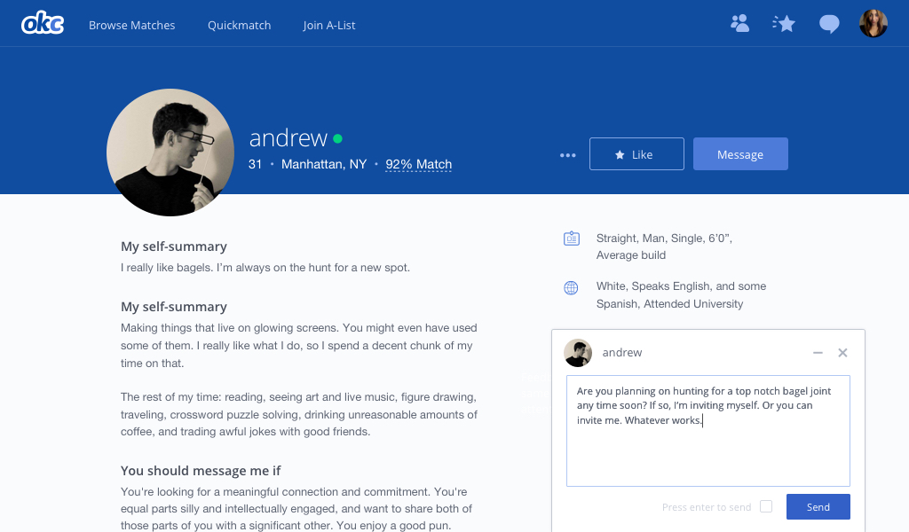
We encourage first contact messages to have substance, and to reference something in the profile. A larger text area for first contacts indicates what a good first message length should be, and the message window gets out of the way of the profile content.
Receiving a message
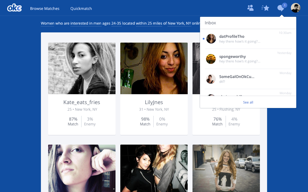
When a user receives a message, a notification appears over the messages navigation icon. Previously, clicking on the icon would cause the user to navigate to the messages section of the site, but now, clicking on the icon opens a dropdown containing a list of the user's messages. New messages are marked with a blue dot.
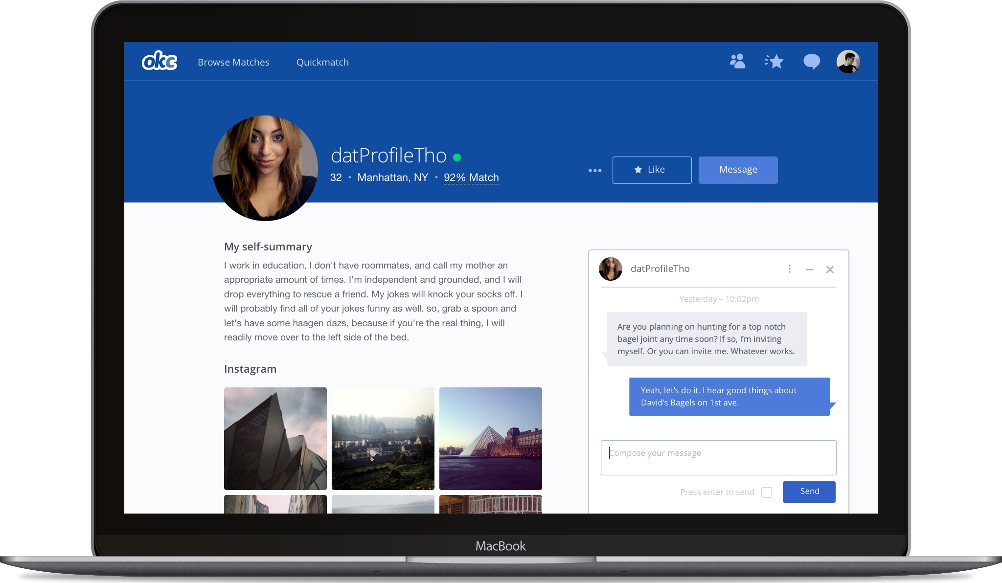
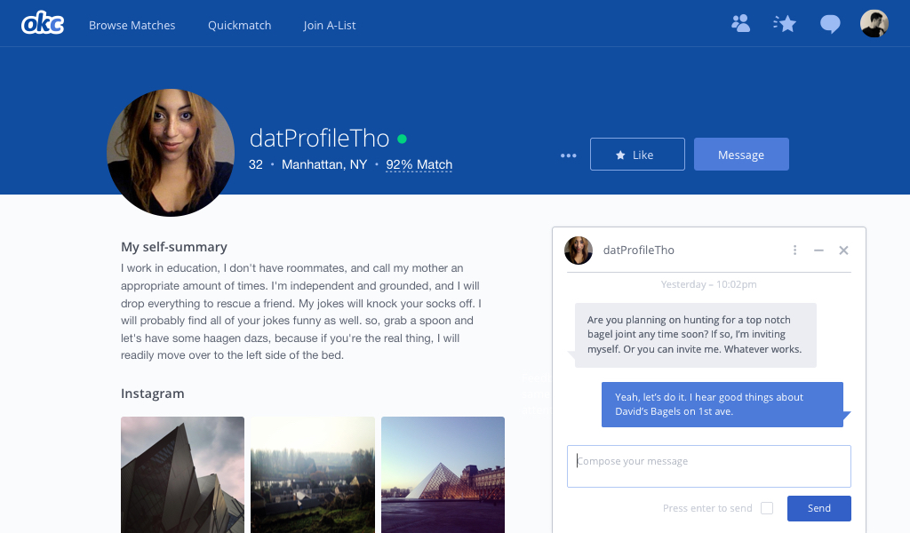
Clicking on one of the message rows opens the conversation panel, which is docked to the bottom right of the viewport. It persists cross page loads, so the conversation can be continued while browsing.
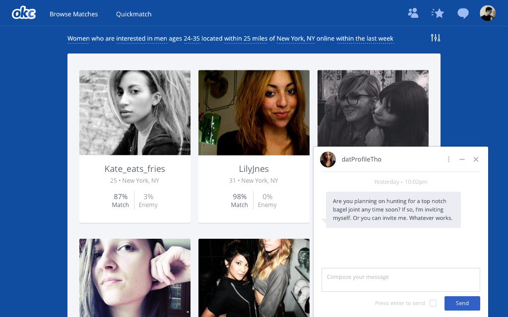
Hovering over the the avatar in the conversation panel will reveal more info about the sender, and clicking on it will navigate to their profile.
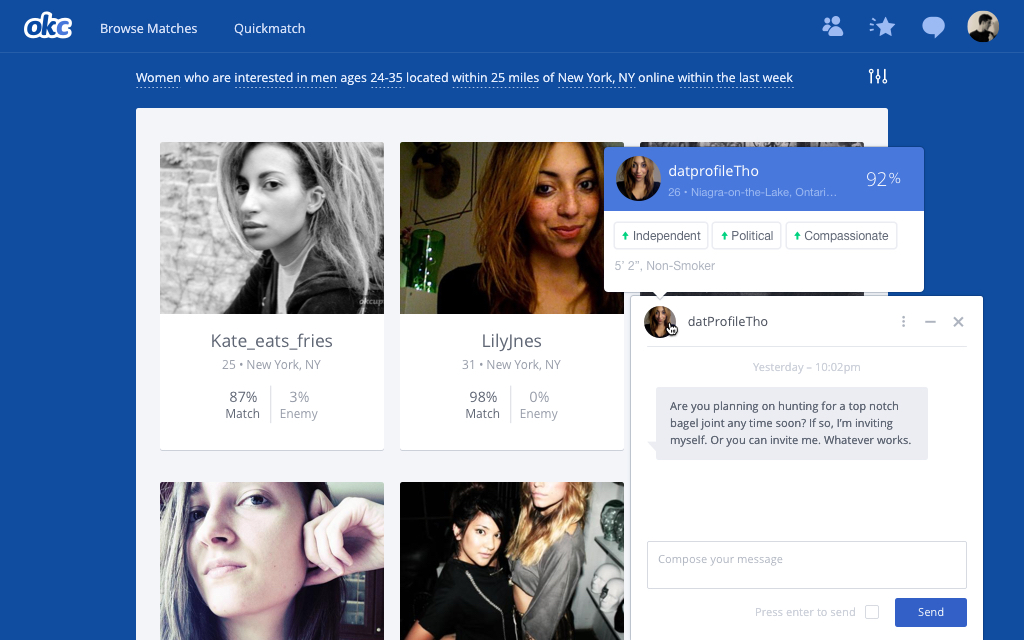
Responding to a Message
The conversation panel is particularly useful when responding to a message. Being able to see the the message and profile simultaneously makes it faster and easier to for the receiver to decide if they are interested, and gives them more information to fuel a conversation.
Results
After running an A/B experiment vs the old messaging system(s), we saw a 6% increase in messages sent. Once launched, that translated into an extra 2.8 million messages sent per month. And as of writing this, there have been 980,549,324 messages sent through the new system.